UWP SemanticZoom control by Paula Scholz
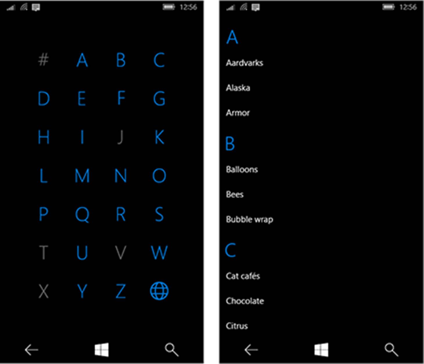
Recently, I worked on a project where one of the requirements was to provide an index to a set of data items displayed by a GridView like the Contacts List of Windows Phone, where you can trigger display of an alphabetized index by tapping on one of the header letters, and then tap a letter of this index to jump directly to that section of the GridView where those data items reside. A Microsoft example graphic of a similar implementation on Windows Phone is shown below:
On the Universal Windows Platform for Windows 10, this capability is provided by Microsoft’s SemanticZoom control, and a great introduction to this control may be found here:
https://docs.microsoft.com/en-us/windows/uwp/controls-and-patterns/semantic-zoom
You might give this excellent article a few minutes of your time unless you already understand the basics of SemanticZoom. The screen on the left is the index, or ZoomedOutView, of the SemanticZoom control, and on the right is the data view, or ZoomedInView.
There are a few articles on the web about the SemanticZoom control, and several sample projects, but none of these went into enough depth to show how one would make an index (ZoomedOutView) with grayed-out unclickable members as shown above, and this was one of the features I was asked to implement. Like all developers, I like to search the web for previous work but didn’t find much on this exact subject, so I decided to write this article to help those with a similar problem to solve.
To use the SemanticZoom control, you need a set of data that can be divided into groups, like letters of the alphabet or some other set of distinct categories. For these examples, we’re going to use the ubiquitous Contact list, and once again, Microsoft has provided us with a great class to generate sample data from its ListView and GridView tutorial, located here:
https://docs.microsoft.com/en-us/windows/uwp/controls-and-patterns/listview-and-gridview
I like this Contact class because it can generate any number of sample contact items that can be bound to user interface controls in WPF or UWP projects. We’ve modified the class a bit to generate Contact items as distinct alphabetized Groups to illustrate the powers of SemanticZoom. Let’s look at it:
public class Contact
{
private static Random random = new Random();
#region Properties
private string initials;
public string Initials
{
get
{
if (initials == string.Empty && FirstName != string.Empty && LastName != string.Empty)
{
initials = FirstName[0].ToString() + LastName[0].ToString();
}
return initials;
}
}
private string name;
public string Name
{
get
{
if (name == string.Empty && FirstName != string.Empty && LastName != string.Empty)
{
name = FirstName + " " + LastName;
}
return name;
}
}
private string lastName;
public string LastName
{
get
{
return lastName;
}
set
{
lastName = value;
initials = string.Empty; // force to recalculate the value
name = string.Empty; // force to recalculate the value
}
}
private string firstName;
public string FirstName
{
get
{
return firstName;
}
set
{
firstName = value;
initials = string.Empty; // force to recalculate the value
name = string.Empty; // force to recalculate the value
}
}
public string Position { get; set; }
public string PhoneNumber { get; set; }
public string Biography { get; set; }
#endregion
public Contact()
{
// default values for each property.
initials = string.Empty;
name = string.Empty;
LastName = string.Empty;
FirstName = string.Empty;
Position = string.Empty;
PhoneNumber = string.Empty;
Biography = string.Empty;
}
#region Public Methods
/// <summary>
/// Gets a new contact based on randomly-generated data.
/// </summary>
/// <returns>A single randomly-generated Contact object.<returns>
public static Contact GetNewContact()
{
return new Contact()
{
FirstName = GenerateFirstName(),
LastName = GenerateLastName(),
Biography = GetBiography(),
PhoneNumber = GeneratePhoneNumber(),
Position = GeneratePosition(),
};
}
/// <summary>
/// Randomly generates an ObservableCollection of Contact objects for sample use.
/// </summary>
/// <param name="numberOfContacts"></param>
/// <returns>Returns an ObservableCollection of randomly-generated contacts.</returns>
public static ObservableCollection<Contact> GetContacts(int numberOfContacts)
{
ObservableCollection<Contact> contacts = new ObservableCollection<Contact>();
for (int i = 0; i < numberOfContacts; i++)
{
contacts.Add(GetNewContact());
}
return contacts;
}
We have some Contact properties with backing store variables, a default constructor, and a method called GetNewContact() that generates a new Contact object with randomly chosen data from a hard-coded list of possibilities (not shown here). We’re not going to examine those methods in detail, but the entire class is provided in the complete GitHub sample linked at the bottom of this article.
Only one Contact isn’t very useful though, so there is another method called GetContacts(int numberOfContacts) that returns an ObservableCollection<Contact>, suitable for binding in a WPF or UWP user interface.
This isn’t really what we want, though. What we need to feed the SemanticZoom control is a method that creates groups of Contact objects in alphabetical order, each group representing a letter of the alphabet, so we can display these in the index (ZoomedOutView). To do this, we use a helper class called GroupInfoList, derived from List<T>, that contains a Key property to hold the letter that represents the group. Because the GroupInfoList is derived from List<T>, it is itself a list, and this is where we’re going to store the Contact objects generated for display in the user interface.
The GroupInfoList looks like this:
using System.Collections.Generic;
namespace GroupList.Model
{
/// <summary>
/// This generic GroupInfoList object represents a List<T> of Contact objects associated with a particular Key, in this case, a
/// letter of the alphabet (string). This class is used in Contacts.cs when generating the list of Contact objects to be
/// displayed in the demo, in either Contact.GetContactsGrouped(int) or Contact.GetContactsGroupedAllAlpha(int). The GroupInfoList
/// is used by the EmptyOrFullSelector of the SemanticZoom control's ZoomedOutView to enable clicking on a letter, and is
/// used by the ZoomedInView to provide the Contact objects for a letter, and to provide the letter to use in the ZoomedInView's
/// header row for each group.
/// </summary>
public class GroupInfoList : List<object>
{
/// <summary>
/// The Key represents a letter of the alphabet. So, what we really have in this GroupInfoList is a list of Contact objects
/// organized by the first letter of the LastName property of a Contact.
/// </summary>
public object Key { get; set; }
}
}
This class is very simple, but as we’ll see, an ObservableCollection<GroupInfoList> of this class is what we will use to drive our user interface.
To display Contact objects in the UI, we could simply bind an ObservableCollection<Contact> to a ListView or GridView, but to use the SemanticZoom control to display our Contact objects in groups, we need to use a UWP framework class called a CollectionViewSource, and the Microsoft documentation for this class may be found here:
https://docs.microsoft.com/en-us/uwp/api/Windows.UI.Xaml.Data.CollectionViewSource
As the documentation states, you “typically define a CollectionViewSource as a XAML resource and bind to it using the {StaticResource} markup extension. You can then set its Source property in code-behind to a supported collection type,” and that’s exactly what we’re going to do here.
Here is part of the XAML for our GroupedListView User Control where we declare the CollectionViewSource:
<UserControl
x:Class="GroupList.GroupList.GroupedListView"
xmlns="http://schemas.microsoft.com/winfx/2006/xaml/presentation"
xmlns:x="http://schemas.microsoft.com/winfx/2006/xaml"
xmlns:local="using:GroupList.GroupList"
xmlns:d="http://schemas.microsoft.com/expression/blend/2008"
xmlns:mc="http://schemas.openxmlformats.org/markup-compatibility/2006"
xmlns:data="using:GroupList.Model"
xmlns:wuxdata="using:Windows.UI.Xaml.Data"
mc:Ignorable="d">
<UserControl.Resources>
<!-- Use a collection view source for content that presents itself as a list of items that can be grouped or sorted.
Otherwise, you can use x:Bind directly on the ListView's item source to for further optimization. Please see the
AppUIBasics sample for an example of how to do this.
https://docs.microsoft.com/en-us/uwp/api/Windows.UI.Xaml.Data.CollectionViewSource -->
<CollectionViewSource x:Name="ContactsCVS" IsSourceGrouped="True" />
In the code-behind for the User Control, in the constructor, we assign the Source property of the CollectionViewSource to the ObservableCollection<GroupInfoList> we create here, like this:
public GroupedListView()
{
this.InitializeComponent();
// Sets the CollectionViewSource to an ObservableCollection of GroupInfoList objects
// containing Contacts generated randomly.
ContactsCVS.Source = Contact.GetContactsGroupedAllAlpha(200);
}
Notice we’ve introduced a new function as part of the Contact class, GetContactsGroupedAllAlpha(int numberOfContacts). This function, along with the GroupInfoList class, is what creates the Contact groups exposed to the UI by the CollectionViewSource. This function is the heart of our example and creates an ObservableCollection of GroupInfoList objects with and without Contacts, and provides the data to display grayed-out group headers in the index (ZoomedOutView) of the SemanticZoom control. We’ll want to examine this function in detail.
/// <summary>
/// Like GetContactsGrouped, this generates an ObservableCollection of GroupInfoLists, but does it a bit
/// differently. For Contact groups that have no Contact data members, this will generate an empty GroupInfoList
/// object representing the letter (or number), and allow you to display a ZoomedOutView just like the Contacts list
/// on Windows Phone, where empty groups with no Contacts are grayed out and not selectable.
/// </summary>
/// <param name="numberOfContacts"></param>
/// <returns>An ObservableCollection of GroupInfoList objects containing Contact objects.</returns>
public static ObservableCollection<GroupInfoList> GetContactsGroupedAllAlpha(int numberOfContacts)
{
ObservableCollection<GroupInfoList> groups = new ObservableCollection<GroupInfoList>();
// get an ObservableCollection of Contact objects (it could also be a List<Contact>).
var generatedContacts = GetContacts(numberOfContacts);
// the letters/numbers representing our GroupInfoList Keys
var letters = "ABCDEFGHIJKLMNOPQRSTUVWXYZ0123456789".ToList();
// This Linq expression creates an IEnumerable collection of anonymous types containing the letter/number
// Key of the group, and its associated Contact objects by iterating through the List of letters/numbers
// and getting the Contact objects where the LastName property starts with that letter/number, ordering them
// by LastName.
var groupByAlpha = from letter in letters
select new
{
Key = letter.ToString(),
query = from item in generatedContacts
where item.LastName.StartsWith(letter.ToString(), StringComparison.CurrentCultureIgnoreCase)
orderby item.LastName
select item
};
// Now, we create the GroupInfoList objects and add them to our returned ObservableCollection.
// iterate through the IEnumerable 'groupByAlpha' created above
foreach (var g in groupByAlpha)
{
// make a new GroupInfoList object
GroupInfoList info = new GroupInfoList();
// assign its key (letter/number)
info.Key = g.Key;
// iterate through all the Contact objects for that Key and add them to the GroupInfoList. If the
// Key has no Contacts, then none will be added and that GroupInfoList will be empty.
foreach(var item in g.query)
{
info.Add(item);
}
// add the GroupInfoList to the ObservableCollection to be returned
groups.Add(info);
}
return groups;
}
First, we create an ObservableCollection<GroupInfoList> used to return our values to the CollectionViewSource object that will feed Contacts to the user interface. Then, we generate some Contact objects that will be organized into GroupInfoList objects and store them in a temporary ObservableCollection (we could also have used a List). Next, we create a List<char> of characters (letters and numbers) that will represent the Headers to the groups in the GridView control in the ZoomedInView and the Index values in the ZoomedOutView of the SemanticZoom control.
Now, we use a Linq expression to match them up. We iterate through the List<char> of characters and for each letter or number, we make an anonymous type and use another Linq expression to get the Contact objects where the LastName property starts with that character.
Once this is done, we iterate through the IEnumberable containing our anonymous types and make a new GroupInfoList object for each character, iterating through all the Contact objects associated with that character, and add them to our GroupInfoList object. If an anonymous type contains no Contact objects, only its Key property will be set and no Contact objects will be added. Then, we add that GroupInfoList object to the ObservableCollection<GroupInfoList> that we will return to the CollectionViewSource.
Simple, is it not? It is, but this is only half the story. We’ve created our GroupInfoList objects, populated many of them with Contacts, and assigned them to the CollectionViewSource. Let’s see how to use that in the UI.
How does the Contacts list look in the UI? Here is the normal ZoomedInView of the SemanticZoom control using Contact objects:
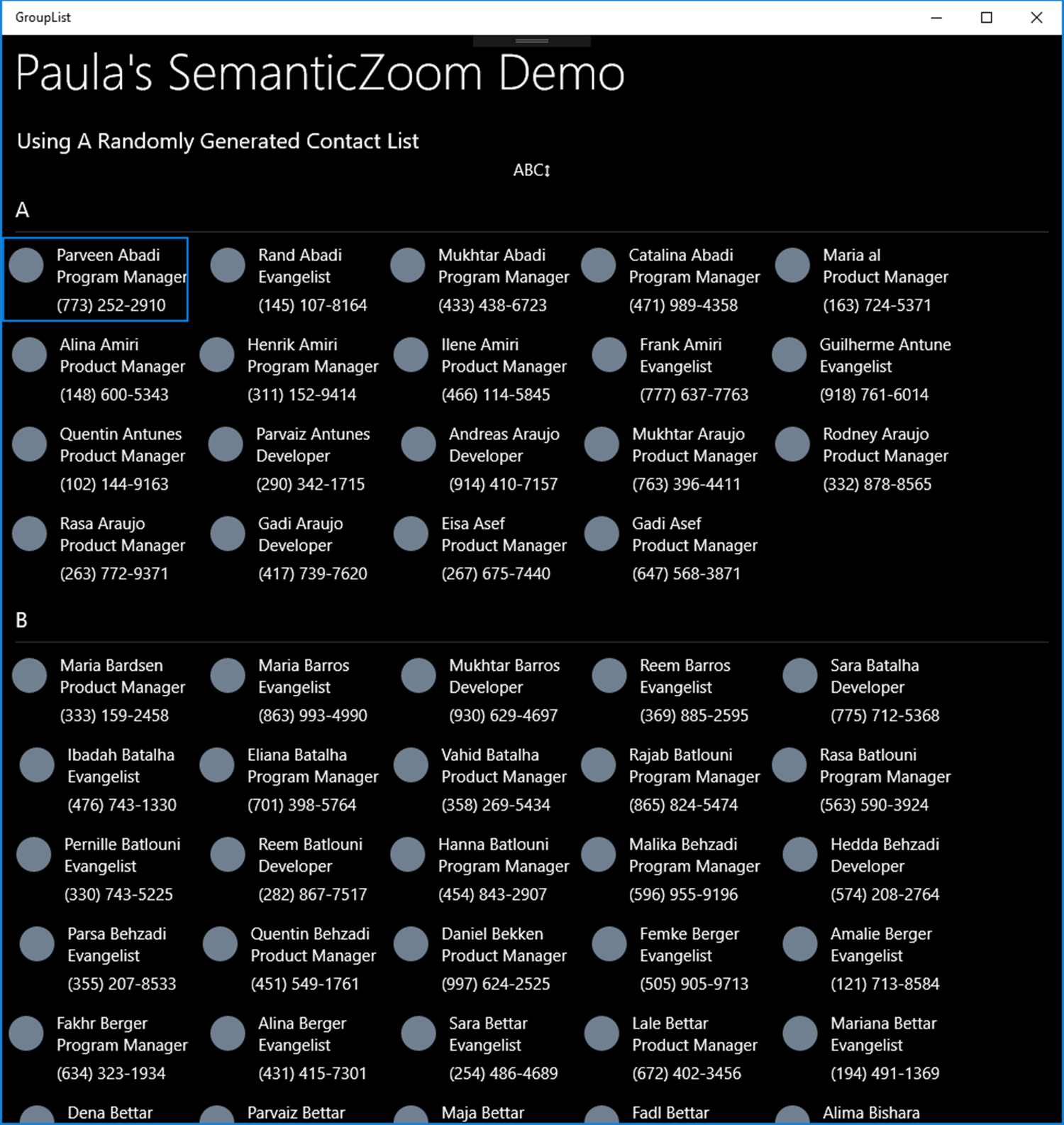
Notice that each group of Contact objects in the GridView has a Header which is set by the Key property of our GroupInfoList object, and a set of Contact objects which are the Contact contents of the GroupInfoList. Let’s look at the XAML that creates this view:
<UserControl
x:Class="GroupList.GroupList.GroupedListView"
xmlns="http://schemas.microsoft.com/winfx/2006/xaml/presentation"
xmlns:x="http://schemas.microsoft.com/winfx/2006/xaml"
xmlns:local="using:GroupList.GroupList"
xmlns:d="http://schemas.microsoft.com/expression/blend/2008"
xmlns:mc="http://schemas.openxmlformats.org/markup-compatibility/2006"
xmlns:data="using:GroupList.Model"
xmlns:wuxdata="using:Windows.UI.Xaml.Data"
mc:Ignorable="d">
<UserControl.Resources>
<!-- Use a collection view source for content that presents itself as a list of items that can be grouped or sorted.
Otherwise, you can use x:Bind directly on the ListView's item source to for further optimization. Please see the
AppUIBasics sample for an example of how to do this.
https://docs.microsoft.com/en-us/uwp/api/Windows.UI.Xaml.Data.CollectionViewSource -->
<CollectionViewSource x:Name="ContactsCVS" IsSourceGrouped="True" />
<!-- This style is used for a letter Group that has one or more Contact members by the ZoomedOutTemplate data template below.-->
<Style TargetType="TextBlock" x:Key="TileHeaderTextStyle">
<Setter Property="FontSize" Value="48" />
<Setter Property="Foreground" Value="White" />
<Setter Property="FontWeight" Value="Bold"/>
</Style>
<!-- This style is used for a letter Group that has no Contact members by the GrayZoomedOutTemplate data template below.-->
<Style TargetType="TextBlock" x:Key="TileHeaderTextStyleGray">
<Setter Property="FontSize" Value="48" />
<Setter Property="Foreground" Value="GhostWhite" />
<Setter Property="FontWeight" Value="Bold" />
<Setter Property="Opacity" Value=".05" />
</Style>
<!-- When using x:Bind, you need to set x:DataType because this binding happens at compile time. Here,
the DataType is the Contact type, enhanced from a Microsoft sample with grouping functions, in Contact.cs.
This is the DataTemplate used by the ZoomedInView of the SemanticZoom control, below.-->
<DataTemplate x:Name="ContactListViewTemplate" x:DataType="data:Contact">
<Grid>
<Grid.RowDefinitions>
<RowDefinition Height="*"/>
<RowDefinition Height="*"/>
<RowDefinition Height="*"/>
</Grid.RowDefinitions>
<Grid.ColumnDefinitions>
<ColumnDefinition Width="Auto"/>
<ColumnDefinition Width="*"/>
</Grid.ColumnDefinitions>
<Ellipse x:Name="Ellipse"
Grid.RowSpan="2"
Width ="32"
Height="32"
Margin="6"
VerticalAlignment="Center"
HorizontalAlignment="Center"
Fill="SlateGray"/>
<TextBlock Grid.Column="1"
Text="{x:Bind Name}"
x:Phase="1"
Margin="6,6,0,0"/>
<TextBlock Grid.Column="1"
Grid.Row="1"
Text="{x:Bind Position}"
TextWrapping="Wrap"
x:Phase="2"
Margin="6,0,0,6"/>
<TextBlock Grid.Column="1"
Grid.Row="2"
Text="{x:Bind PhoneNumber}"
x:Phase="2"
Margin="6,0,0,6"/>
</Grid>
</DataTemplate>
<!-- The GrayZoomedOutTemplate will display a grayed-out letter when a group represented by that letter
has no members. The SemanticZoom control will do nothing when a letter shown by this template is clicked. -->
<DataTemplate x:Key="GrayZoomedOutTemplate" x:DataType="wuxdata:ICollectionViewGroup">
<TextBlock Text="{x:Bind Group.(data:GroupInfoList.Key)}" Style="{StaticResource TileHeaderTextStyleGray}" />
</DataTemplate>
<!-- The ZoomedOutTemplate will display a clickable bold letter when a group represented by that letter
has one or more members. The SemanticZoom control will bring that group into view when clicked. -->
<DataTemplate x:Key="ZoomedOutTemplate" x:DataType="wuxdata:ICollectionViewGroup">
<TextBlock Text="{x:Bind Group.(data:GroupInfoList.Key)}" Style="{StaticResource TileHeaderTextStyle}" />
</DataTemplate>
<!-- The GroupEmptyOrFullSelector is a derived class of the Microsoft DataTemplateSelector class. This object
chooses which DataTemplate to use when displaying Group header items in the ZoomedOutView, below.
https://docs.microsoft.com/en-us/uwp/api/Windows.UI.Xaml.Controls.DataTemplateSelector -->
<local:GroupEmptyOrFullSelector x:Key="GroupEmptyOrFullSelector" Empty="{StaticResource GrayZoomedOutTemplate}" Full="{StaticResource ZoomedOutTemplate}" />
</UserControl.Resources>
<!--#region Navigation Panel -->
<Grid>
<Grid.RowDefinitions>
<RowDefinition Height="Auto"/>
<RowDefinition Height="*"/>
</Grid.RowDefinitions>
<StackPanel Orientation="Vertical">
<TextBlock Margin="15,0,0,0" Text="Paula's SemanticZoom Demo" Grid.Row="0"
Style="{StaticResource HeaderTextBlockStyle}" VerticalAlignment="Center" />
<TextBlock Margin="15,20,0,0" Text="Using A Randomly Generated Contact List" Style="{StaticResource SubtitleTextBlockStyle}" />
<!-- The click event handler for this button toggles the SemanticZoom control's IsZoomedInViewActive property, which
determines whether the Windows.UI.Xaml.Controls.SemanticZoom.ZoomedInView is the active view on the page. -->
<Button x:Name="ZoomInOutBtn" Content="ABC↕" Click="ZoomInOutBtn_Click" Width="60" HorizontalAlignment="Center" BorderThickness="0" Background="Transparent"/>
</StackPanel>
<!--#endregion-->
<!-- This is the actual SemanticZoom control. It has two views, a ZoomedInView, which shows the grouped data with a header on
each Group, and a ZoomedOutView that shows the index to the set of Groups. -->
<SemanticZoom x:Name="ZoomControl" Grid.Row="1">
<!-- The ZoomedInView, here implemented as a GridView. You could also use a ListView. -->
<SemanticZoom.ZoomedInView>
<GridView ItemsSource="{x:Bind ContactsCVS.View}"
ItemTemplate="{StaticResource ContactListViewTemplate}"
SelectionMode="Single"
ShowsScrollingPlaceholders="True">
<!-- This the the style for the Group header, which is bound to the Key property of the GroupInfoList
object. A GroupInfoList is derived from List<T> and has a Key property, the value of which forms the
Group header title. In this demo, each letter of the alphabet represents a Group and has its own list of
Contact objects wherein the LastName property of the Contact starts with the letter of that Group. -->
<GridView.GroupStyle>
<GroupStyle HidesIfEmpty="True">
<GroupStyle.HeaderTemplate>
<DataTemplate x:DataType="data:GroupInfoList">
<TextBlock Text="{x:Bind Path=Key}" />
</DataTemplate>
</GroupStyle.HeaderTemplate>
</GroupStyle>
</GridView.GroupStyle>
</GridView>
</SemanticZoom.ZoomedInView>
<!-- The ZoomedOutView of the SemanticZoom control. This displays the index to the Groups, held
by the CollectionViewSource declared above as a UserControl resource. The DataTemplate used to display
each Group header, or Key, is chosen according to the ItemTemplateSelector, in this case, the
GroupEmptyOrFullSelector object, derived from the Microsoft DataTemplateSelector class, implemented
here in EmptyOrFullSelector.cs. If a Group representing a particular letter has no Contact objects,
the GroupEmptyOrFullSelector will choose the GrayZoomedOutTemplate resource to display its letter.
The ZoomedOutView is triggered by the user clicking on a Group header, or by toggling the ZoomInOutBtn.
The Width of the enclosing GridView was chosen visually by trial and error to accomodate even Letter rows
in this demo. Implementations for different platforms might want to use a VisualStateManager to
choose the width, depending upon which platform and orientations you want to support, but that's beyond
the scope of this simple demo.
You could also use a ListView here.
-->
<SemanticZoom.ZoomedOutView>
<GridView ItemTemplateSelector="{StaticResource GroupEmptyOrFullSelector}"
ItemsSource="{x:Bind ContactsCVS.View.CollectionGroups}" HorizontalAlignment="Center"
ScrollViewer.VerticalScrollBarVisibility="Disabled" VerticalAlignment="Center"
Width="475" SelectionMode="None" >
</GridView>
</SemanticZoom.ZoomedOutView>
</SemanticZoom>
</Grid>
</UserControl>
This is the entire XAML file of our GroupListView UserControl. First, we define some StaticResources to be used in the control, the first of which is our CollectionViewSource object. Next, two Styles used to display a clickable or grayed-out Key in the ZoomedOutView. Then, the two DataTemplate objects that will display the characters in our index on the ZoomedOutView and on the group Headers in the ZoomedInView of the SemanticZoom control. Next, the simple DataTemplate used to display a Contact item in the ZoomedInView’s GridView control
Then, a very important component, the DataTemplateSelector used by the ZoomedOutView to select which DataTemplate to use when displaying a GroupInfoList Key property on the ZoomedOutView. The DataTemplateSelector is a Microsoft class for implementing the logic needed to choose a correct DataTemplate for display during binding, depending on the contents of the object to be displayed and the logic used to choose the template. In our project, the DataTemplateSelector is implemented as the GroupEmptyOrFullSelector class. The DataTemplateSelector base class is documented here:
https://docs.microsoft.com/en-us/uwp/api/Windows.UI.Xaml.Controls.DataTemplateSelector
In our GroupEmptyOrFullSelector DataTemplateSelector-derived class, we override SelectTemplateCore like this:
/// <summary>
/// This override contains the logic used to decide which DataTemplate to use when binding the Key of a GroupInfoList
/// in the SemanticZoom control's ZoomedOutView, which displays the index to the Contact Groups. This function will
/// be called for each GroupInfoList object during binding.
/// </summary>
/// <param name="item"></param>
/// <param name="container"></param>
/// <returns>A DataTemplate object to use when binding.</returns>
protected override DataTemplate SelectTemplateCore(object item, DependencyObject container)
{
// get the Type of the object calling us
var itemType = item.GetType();
// we only want to execute the logic on GroupInfoList objects
var isGroup = itemType.Name == "GroupInfoList";
bool isEmpty = false;
GroupInfoList groupItem;
// if we're dealing with a GroupInfoList, evaluate whether or not it has data members
if (isGroup)
{
groupItem = item as GroupInfoList;
// if a GroupInfoList has no Contact data members, it is Empty.
isEmpty = groupItem.Count == 0;
// Disable empty items
var selectorItem = container as SelectorItem;
// If a SelectorItem is not null, it contains data members (Contact objects) so we need to enable its
// ability to be selected (clicked) in each Group header of the ZoomedInView,
// and on the index to all the groups in the ZoomedOutView of the SemanticZoom control.
if (selectorItem != null)
{
selectorItem.IsEnabled = !isEmpty;
}
// return the correct DataTemplate, which was set in our XAML, for this GroupInfoList
if (isEmpty)
{
// the DataTemplate used to display Contact groups with no Contact members
return Empty;
}
else
{
// the DataTemplate used to display Contact groups with one or more Contact members
return Full;
}
}
// The default return, because we have to have return a DataTemplate. This will be meaningless to
// any DependencyObject which calls us that is not a SelectorItem, but if we return
// null instead, the ZoomedOutView will not work.
return Full;
}
As you can see by looking at the XAML, the DataTemplate chosen for bound GroupInfoList objects that contain no Contact objects is the Empty template, and for GroupInfoList objects that do contain one or more Contact objects, we return the Full template. These templates are set in the XAML declaration of GroupEmptyOrFullSelector in the UserControl.Resources section.
Now we come to the part of the XAML that renders our User Control. First, a Grid definition and a couple of simple TextBlock objects for our control header text, and then a Button that toggles the ZoomedInView or ZoomedOutView state of our SemanticZoom control in code-behind. This state can also be triggered by clicking on the Header of the ZommedInView’s GridView for any group.
Next, the SemanticZoom control itself. Let’s take a look at the ZoomedInView:
<!-- This is the actual SemanticZoom control. It has two views, a ZoomedInView, which shows the grouped data with a header on
each Group, and a ZoomedOutView that shows the index to the set of Groups. -->
<SemanticZoom x:Name="ZoomControl" Grid.Row="1">
<!-- The ZoomedInView, here implemented as a GridView. You could also use a ListView. -->
<SemanticZoom.ZoomedInView>
<GridView ItemsSource="{x:Bind ContactsCVS.View}"
ItemTemplate="{StaticResource ContactListViewTemplate}"
SelectionMode="Single"
ShowsScrollingPlaceholders="True">
<!-- This the the style for the Group header, which is bound to the Key property of the GroupInfoList
object. A GroupInfoList is derived from List<T> and has a Key property, the value of which forms the
Group header title. In this demo, each letter of the alphabet represents a Group and has its own list of
Contact objects wherein the LastName property of the Contact starts with the letter of that Group. -->
<GridView.GroupStyle>
<GroupStyle HidesIfEmpty="True">
<GroupStyle.HeaderTemplate>
<DataTemplate x:DataType="data:GroupInfoList">
<TextBlock Text="{x:Bind Path=Key}" />
</DataTemplate>
</GroupStyle.HeaderTemplate>
</GroupStyle>
</GridView.GroupStyle>
</GridView>
</SemanticZoom.ZoomedInView>
The ZoomedInView section contains a GridView, bound to the View property of the ContactsCVS CollectionViewSource declared in the UserControl.Resources section. Remember, we set the Source of this CollectionViewSource in code-behind for the user control, in its constructor. Each Contact item will be displayed by the ContactListViewTemplate, also declared in the UserControl.Resources.
The GridView.GroupStyle declaration controls how we display each Contact group’s Header in the GridView. Note that we set its HideIfEmpty property to True so that we don’t show empty rows with no Contact objects in the ZoomedInView. Then, we set the HeaderTemplate with an inline DataTemplate and declare the x:DataType as GroupInfoList and bind a TextBlock to the GroupInfoList Key property.
Now, we look at the ZoomedOutView which displays the index to each of the groups. This XAML is below:
<!-- The ZoomedOutView of the SemanticZoom control. This displays the index to the Groups, held
by the CollectionViewSource declared above as a UserControl resource. The DataTemplate used to display
each Group header, or Key, is chosen according to the ItemTemplateSelector, in this case, the
GroupEmptyOrFullSelector object, derived from the Microsoft DataTemplateSelector class, implemented
here in EmptyOrFullSelector.cs. If a Group representing a particular letter has no Contact objects,
the GroupEmptyOrFullSelector will choose the GrayZoomedOutTemplate resource to display its letter.
The ZoomedOutView is triggered by the user clicking on a Group header, or by toggling the ZoomInOutBtn.
The Width of the enclosing GridView was chosen visually by trial and error to accomodate even Letter rows
in this demo. Implementations for different platforms might want to use a VisualStateManager to
choose the width, depending upon which platform and orientations you want to support, but that's beyond
the scope of this simple demo.
You could also use a ListView here.
-->
<SemanticZoom.ZoomedOutView>
<GridView ItemTemplateSelector="{StaticResource GroupEmptyOrFullSelector}"
ItemsSource="{x:Bind ContactsCVS.View.CollectionGroups}" HorizontalAlignment="Center"
ScrollViewer.VerticalScrollBarVisibility="Disabled" VerticalAlignment="Center"
Width="475" SelectionMode="None" >
</GridView>
</SemanticZoom.ZoomedOutView>
</SemanticZoom>
</Grid>
Here, we use a GridView to display the Key property of our GroupInfoList objects and the ItemsSource of the GridView is the CollectionViewSource’s View.CollectionGroups collection. We select which data template to use with our GroupEmptyOrFullSelector StaticResource declared previously in UserControl.Resources and implemented in code in EmptyOrFullSelector.cs. The Width of the GridView is chosen empirically by trial and error here to give us an even number of Key properties on each row, but you might want to use a VisualStateManager to choose a Width if you are writing this for multiple platforms. The SelectionMode is set to None because each GroupInfoList object has its SelectionMode set in the ItemTemplateSelector, depending on whether or not it contains contacts.
This XAML gives us a ZoomedOutView that looks like this:

Note that each Key property selects its DataTemplate for display based on the GroupEmptyOrFullSelector. Clicking on an individual character will switch the SemanticZoom control to the ZoomedInView, bringing the desired Header and group into view.
And that’s it! We’ve implemented a SemanticZoom control for Windows 10 that looks and works just like the one on Windows Phone.
The complete source code and project is available at my GitHub repository at https://github.com/Swifter/GroupInfoList
I hope you enjoyed my little article and that you find it useful. Happy programming!
Paula Scholz, Seattle, WA USA